The project
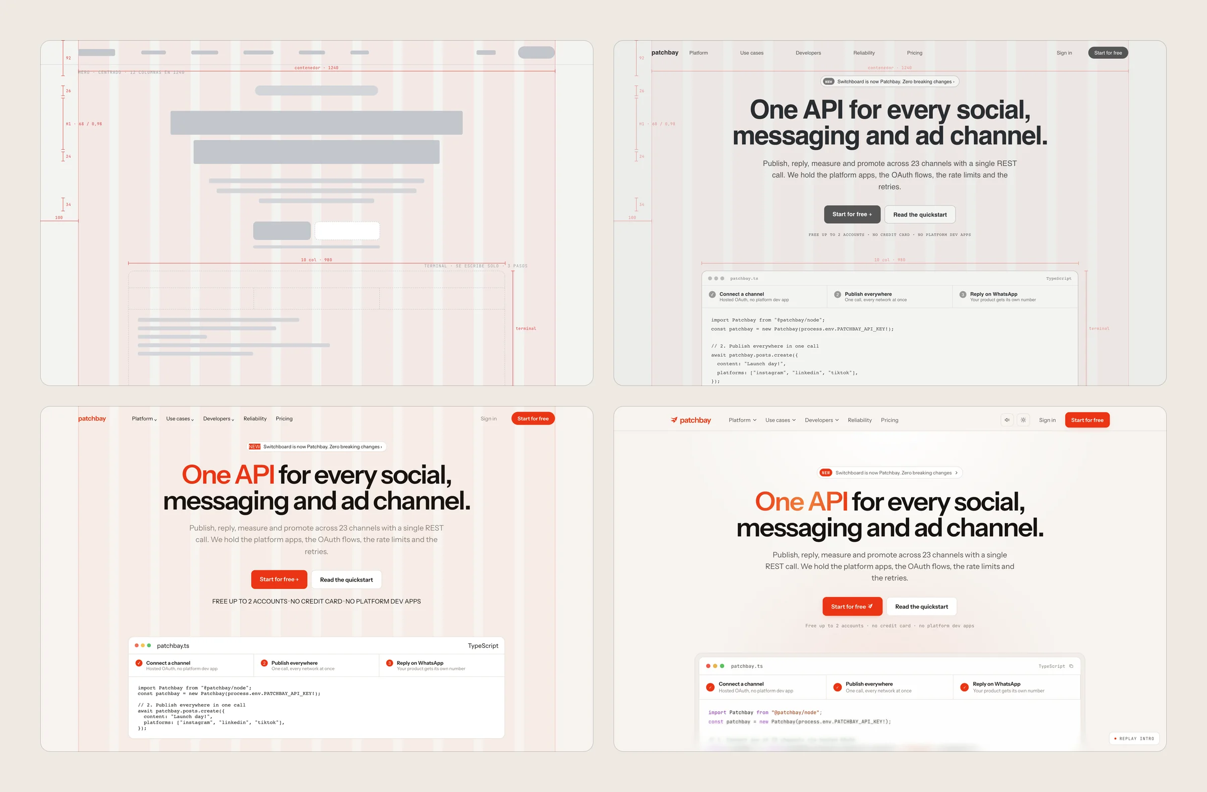
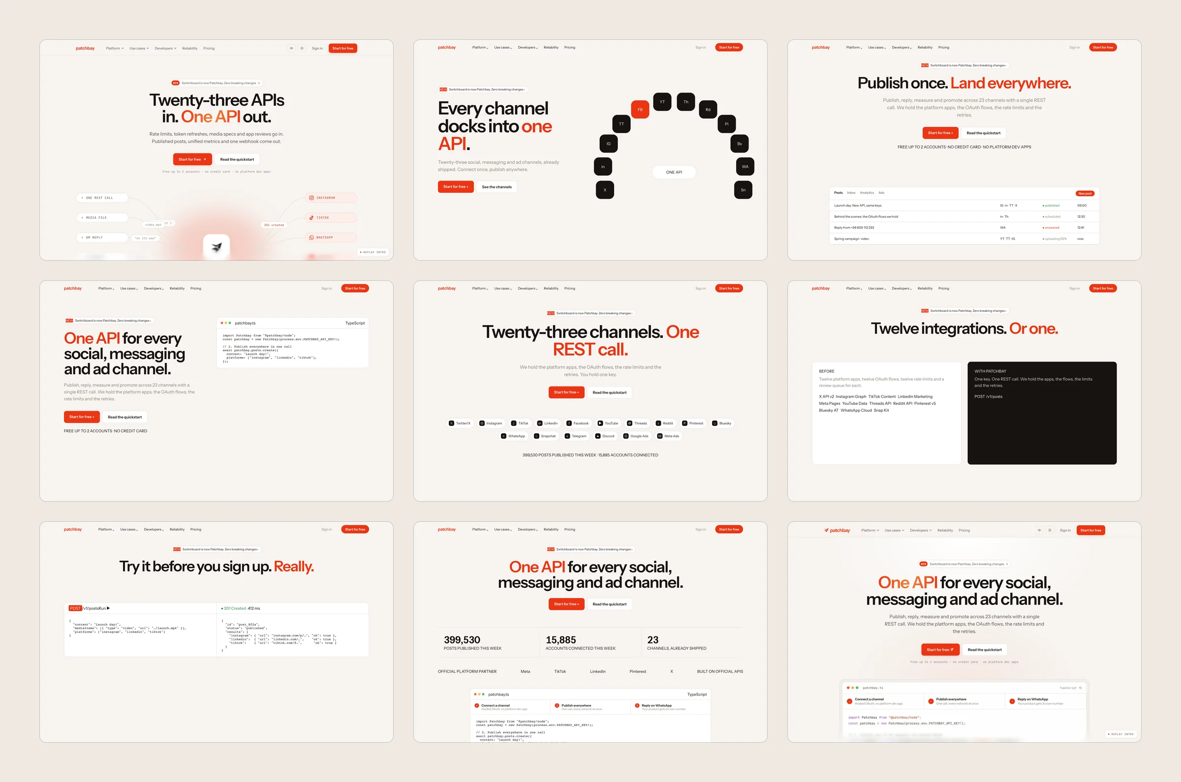
Patchbay is a piece of our own to show that agentic development works with human guidance: the landing page of a fictional API that connects a product to 23 channels, designed with Claude Design and taken to production with Claude Code.
The design and its choreography come out of Claude Design as an artifact. Claude Code turns it into a site of its own without touching what was already right. Then a week of rounds guided from savvia: each one starts with a decision of ours and the AI turns it into a change measured in Chrome and WebKit.
That is how a starting design becomes a real website: how each section comes in, which portraits tell the story, how much the page may weigh. Every round is written down so the next one starts knowing.
From Claude Design to the site
Colour
The palette of Patchbay, by how much it is used on the delivered site. Hover over a colour.
Usage measured on recordings of the delivered site: every pixel counts towards the nearest colour; photos and gradients aside.
Typography
Measured on the site, at 1440 px and at 390 px. Sizes grouped by role. Headings shown scaled down.
- H1Patchbay44 → 68 px
- H2Patchbay30 → 44 px
- H3 LPatchbay27 px
- H3Patchbay19 px
- LeadAn API for social networks and messaging across 23 channels, presented as a dock where each one moors.21 px
- QuoteAn API for social networks and messaging across 23 channels, presented as a dock where each one moors.18 px
- TextAn API for social networks and messaging across 23 channels, presented as a dock where each one moors.15 px
- SmallAn API for social networks and messaging across 23 channels, presented as a dock where each one moors.14 px
- CodePatchbay13 px
- DetailPatchbay12 px
- LabelPatchbay11 px
Spacing
- Base step
- Fluid
- Between sections
- 92 px
- Container
- 1176 px
- 7padding, 153 times
- 9padding, 67 times
- 10padding, 83 times
- 11gap, 56 times
- 12padding, 105 times
- 14padding, 52 times
- 18padding, 72 times
- 20gap, 68 times
- 26padding, 70 times
The paddings, margins and gaps that repeat most on the delivered site, at 1440 px and true scale. They are fluid sizes, which change with the window width, with no fixed step.
Animations
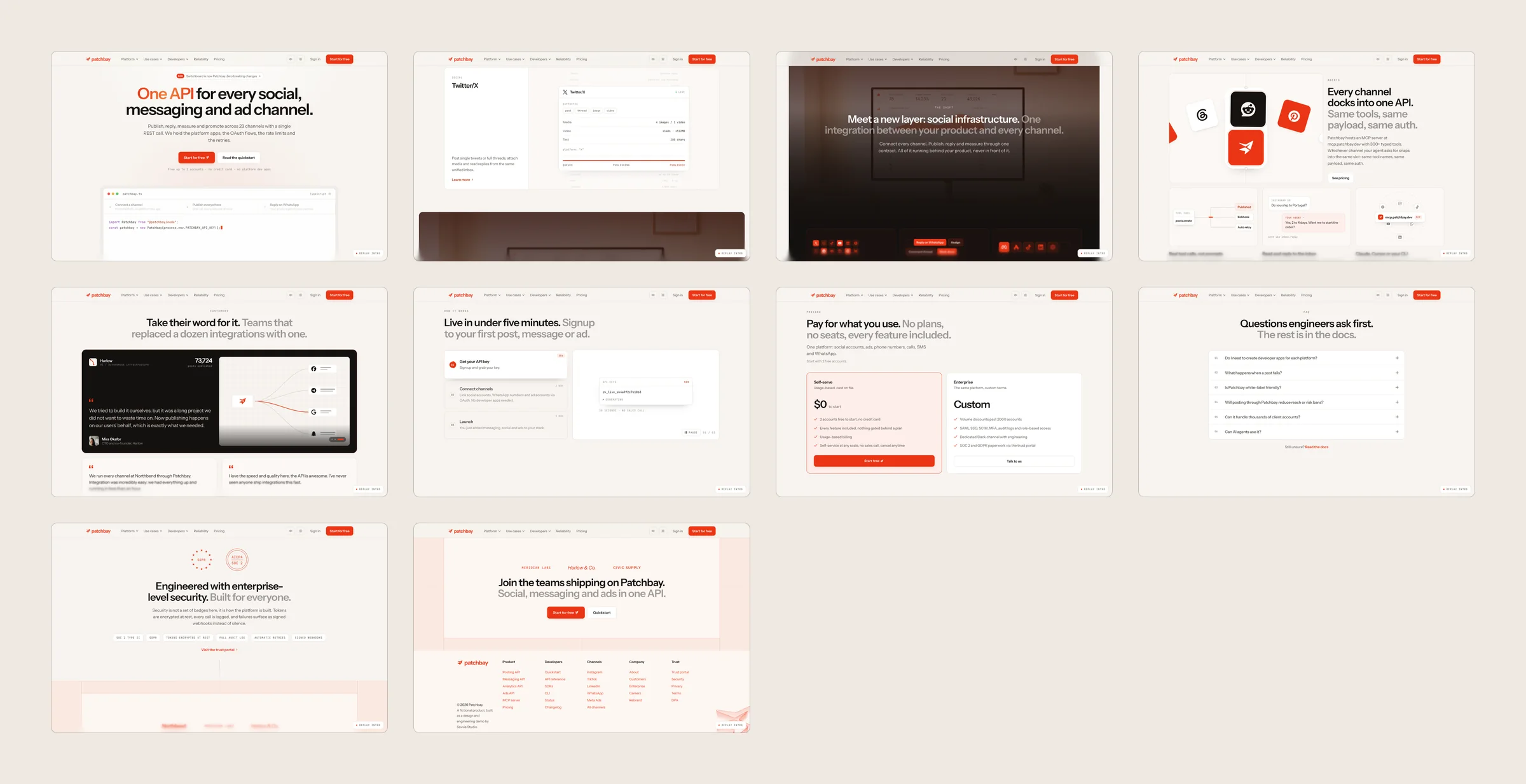
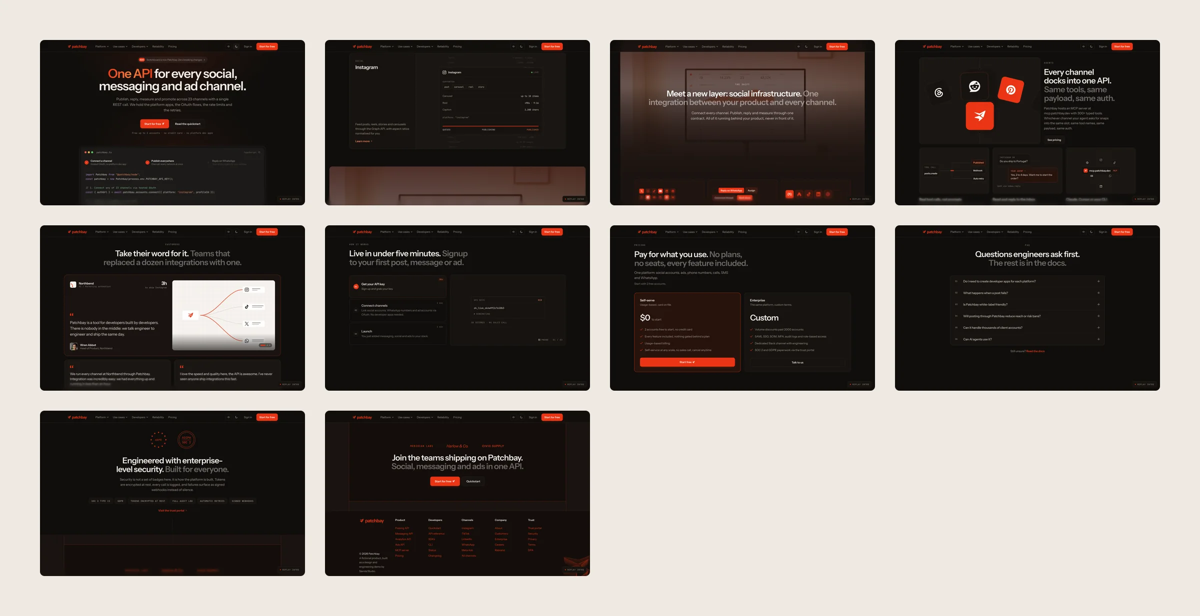
The animations tell the product’s story and let whoever lands here understand quickly what it offers: the channels moor one by one at the API, the steps complete in the time they promise and the intro draws the mark before opening the page. Because it is built in code, every detail can be animated and measured.
The handover
With a site like this, the client would take away its library: the design system generated from the code itself (the brand on φ, the two typefaces, the single accent, the sound and every component) and the guide to connecting the repository to Claude. With it, their team creates new pages in the same aesthetic by asking the AI, without stepping outside what was decided.
Under the hood
Tools
- Claude Design
- HTML a medida
- React 18
- CSS
- Web Audio
- Vercel
- GitHub


In numbers
- 15 rounds of human feedback
- 23 channels in one API
- 580 KB load, down from 5.7 MB
Conclusion
A design made with AI becomes a real website in a week of rounds with judgement: brand, mobile, performance and detail that used to be weeks of work are now days of direction and measuring.
The AI proposes and checks. savvia decides. Every round is written down with what was asked, what was decided and what was measured.
It is the way we offer to work: agentic design and development from start to finish, with a person in charge.