The project
The page presents their whole catalogue: model compression, security, orchestration, their largest model and the platform to deploy them.
Every technical idea has its own image: a sphere that compresses, a matrix that keeps a third of its data, a model that travels from the cloud to the device without disappearing.
The challenge
Explain model compression to the person who signs off the compute bill, with technical evidence and without losing anyone along the way. All on a single dark, serious page with the brand red as the only accent.
How we built it
Direction
24 design rounds, with review notes left on the page itself. Every rejected decision went onto a list of 73 rules that don’t come back.
System
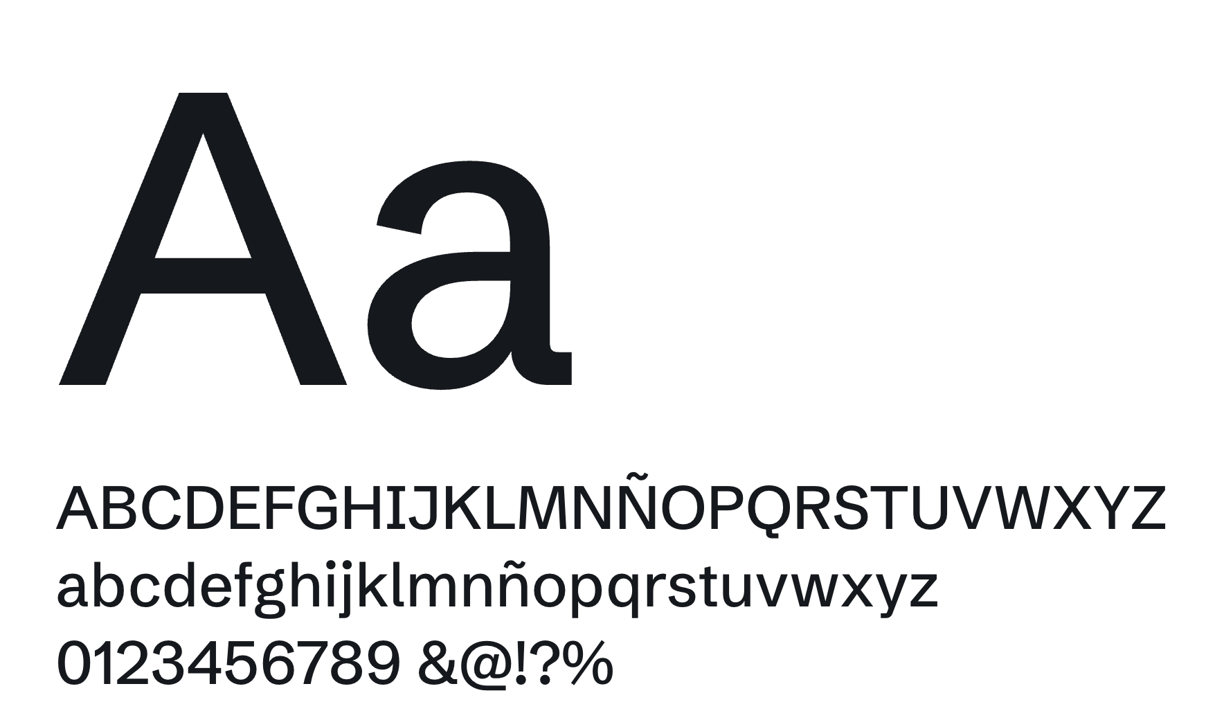
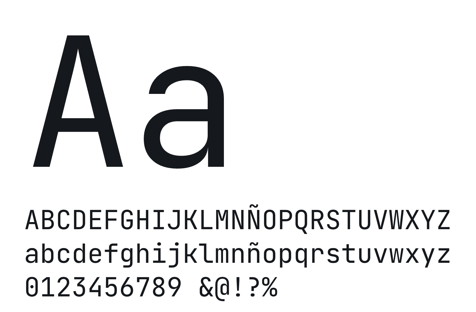
Trimmed to the essentials: two typefaces, a single red, dark theme only and two radii (there had been eight). Balanced headlines with text-wrap and heights in lvh and dvh.
Illustration
Fifteen isometric illustrations generated in code with a custom script: they are drawn in line and then filled, like a plan being built.
Motion
GSAP and ScrollTrigger with Lenis in charge of the clock. Nothing bounces: what falls, falls with gravity and settles.
Measuring
Before optimising, we measured with a real wheel and in interleaved pairs. Three “obvious” optimisations made the result worse and were dropped.
The details
Colour
The palette of Quantus, by how much it is used on the delivered site. Hover over a colour.
Usage measured on recordings of the delivered site: every pixel counts towards the nearest colour; photos and gradients aside.
Typography
Measured on the site, at 1440 px.

Spacing
- Base step
- Fluid
- Between sections
- 158 px
- Container
- 1325 px
- 7gap, 38 times
- 8gap, 100 times
- 10gap, 108 times
- 12gap, 50 times
- 16gap, 58 times
- 18padding, 88 times
- 20padding, 57 times
- 22padding, 41 times
- 28padding, 41 times
The paddings, margins and gaps that repeat most on the delivered site, at 1440 px and true scale; fluid sizes (they change with the window width), with no fixed step.
Motion
Every loop pauses off-screen and Lenis drives GSAP’s clock.
The sphere that compresses
3,000 dots tied to the scroll form the isotype as the size drops from 100% to 5%.
A plan being built
Every place the model runs is an isometric illustration drawn in line and then filled.
The stack
The products fall with gravity on entering and what is underneath gives way 3.2 px as they land.
Under the hood
Tools
- HTML y CSS a medida
- GSAP + ScrollTrigger
- Lenis
- Canvas 2D
- Vercel


How it is built
- A single hand-written, self-contained HTML file of around 440 KB
- The sphere, the profiler and the tensor in Canvas 2D; the illustrations as inline SVG
- Every loop pauses off-screen and Lenis drives GSAP’s clock
- The round against scroll jank cut main-thread work from 40.1 s to 26.4 s, and frames over 20 ms from 2.5% to 0.9%
- Reduced motion respected: no loops, with the logo already formed
- Published on Vercel with immutable caching for assets
In numbers
- 11 sections
- 15 isometric illustrations
- 512 cubes in the footer tensor
- 24 design rounds
- 87 measuring tools written
What we dropped
- A CSS 3D Rubik’s cube for the footer: replaced by the canvas tensor
- Elastic bounces and “squash and stretch”: the brand asked for seriousness
- The light theme: the page is dark from start to finish
- Removing the header blur to gain speed: measured, it made things worse (3.32 → 3.63 s)
Conclusion
A single page explains the entire catalogue without requiring technical knowledge: every idea has its image, and the hero sphere sums up the product before anything is read.
It was closed in 24 design rounds, with 73 rules for what doesn’t come back, and it was measured before optimising: main-thread work dropped from 40.1 s to 26.4 s.

“The client’s testimonial about this project goes here: two or three lines, with their charcoal portrait. Placeholder for Eric.”